Inquire personally now:
Hubertus von Kolkow
+49 731 140 36 – 10
h.vkolkow@agentur-halma.de

Inquire personally now:
Hubertus von Kolkow
+49 731 140 36 – 10
h.vkolkow@agentur-halma.de
Share this post on:
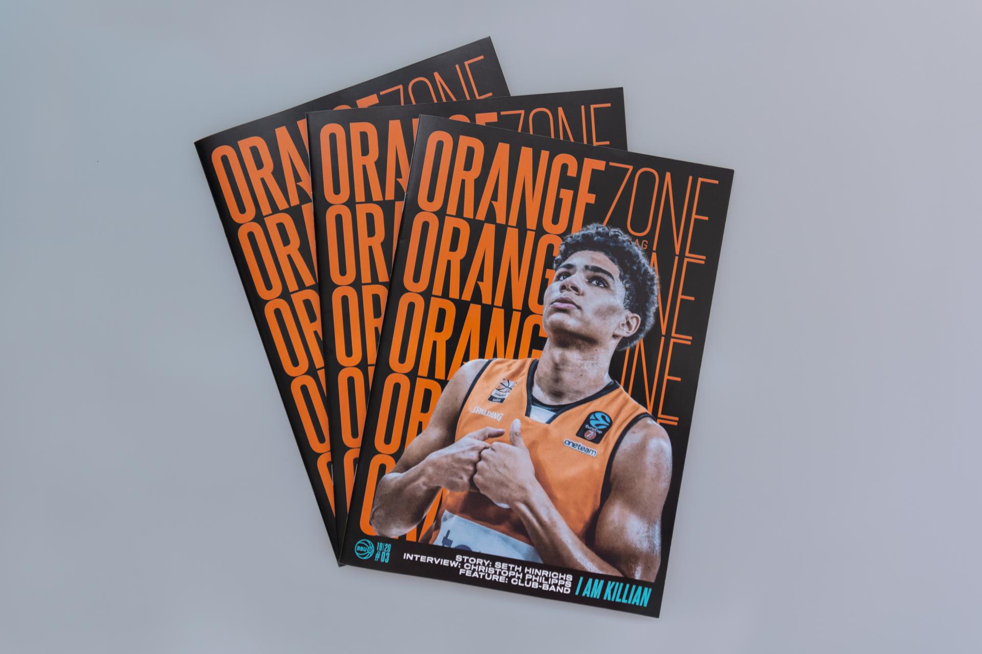
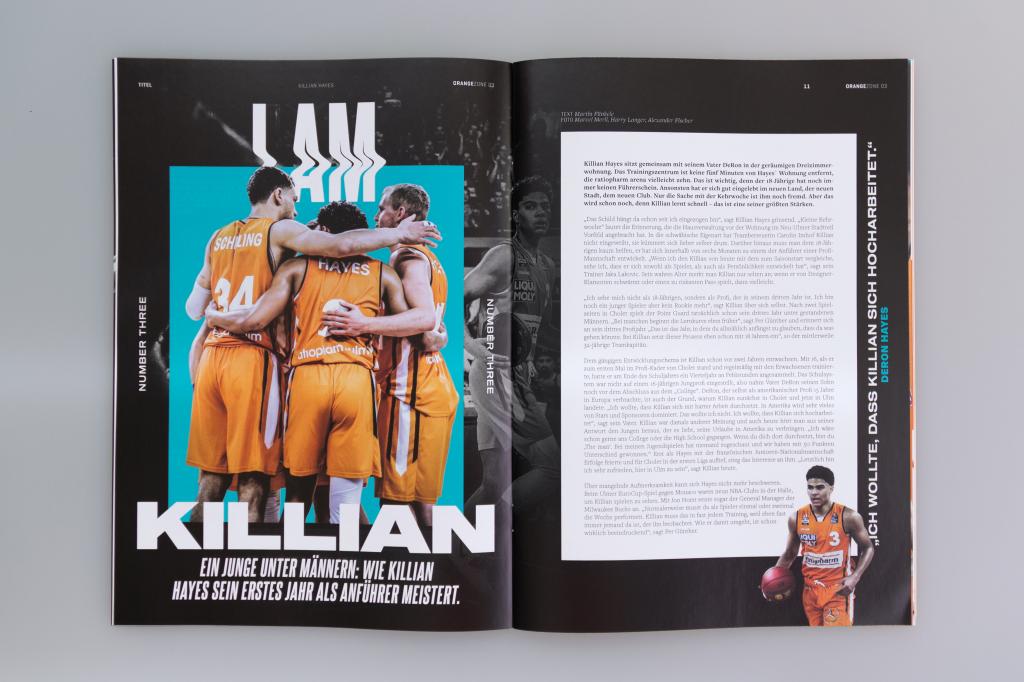
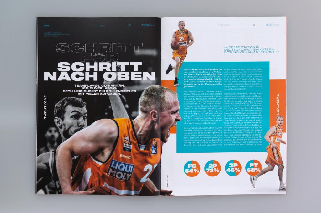
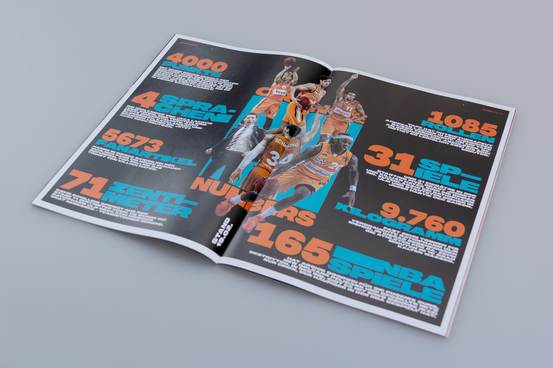
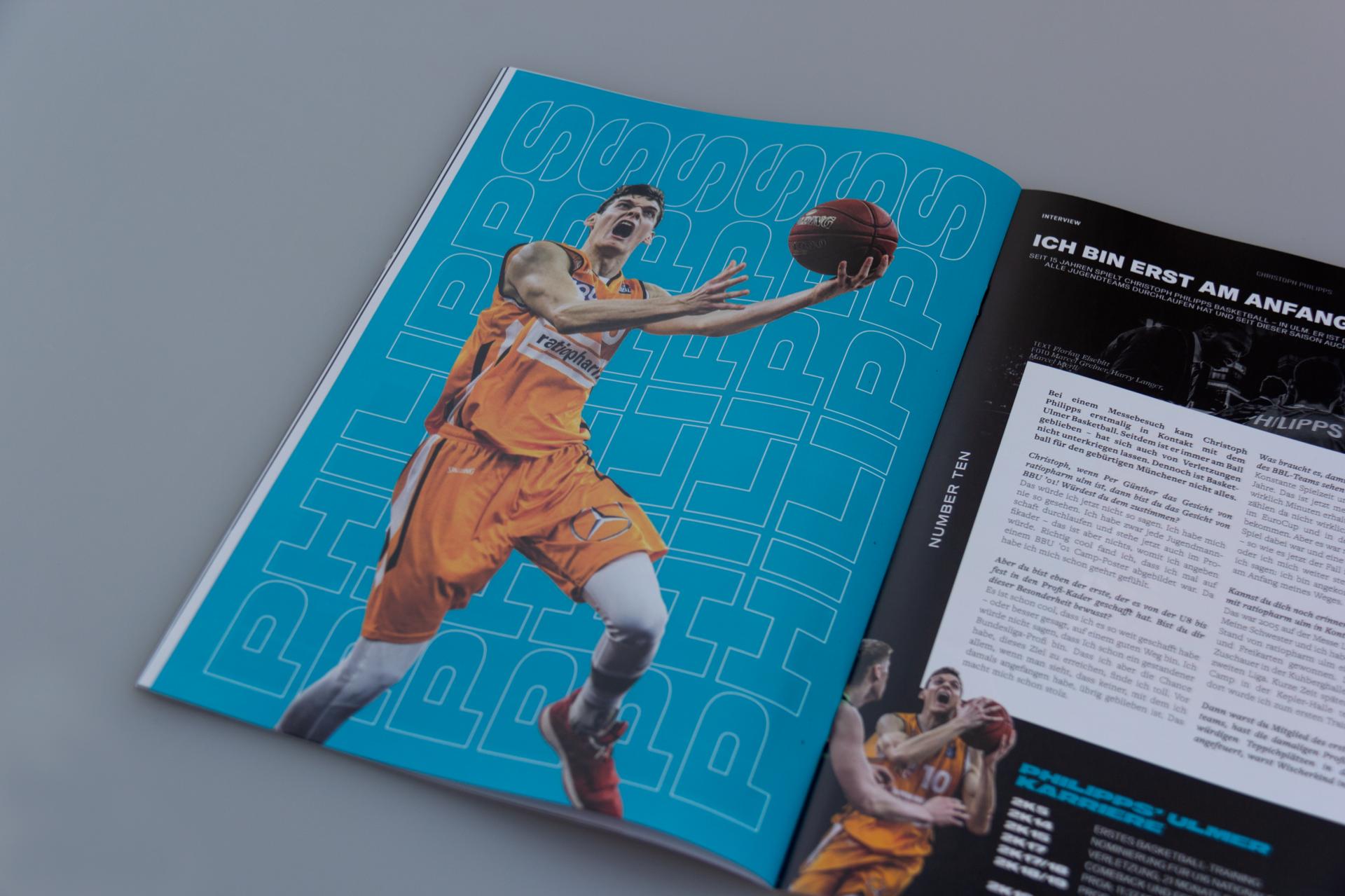
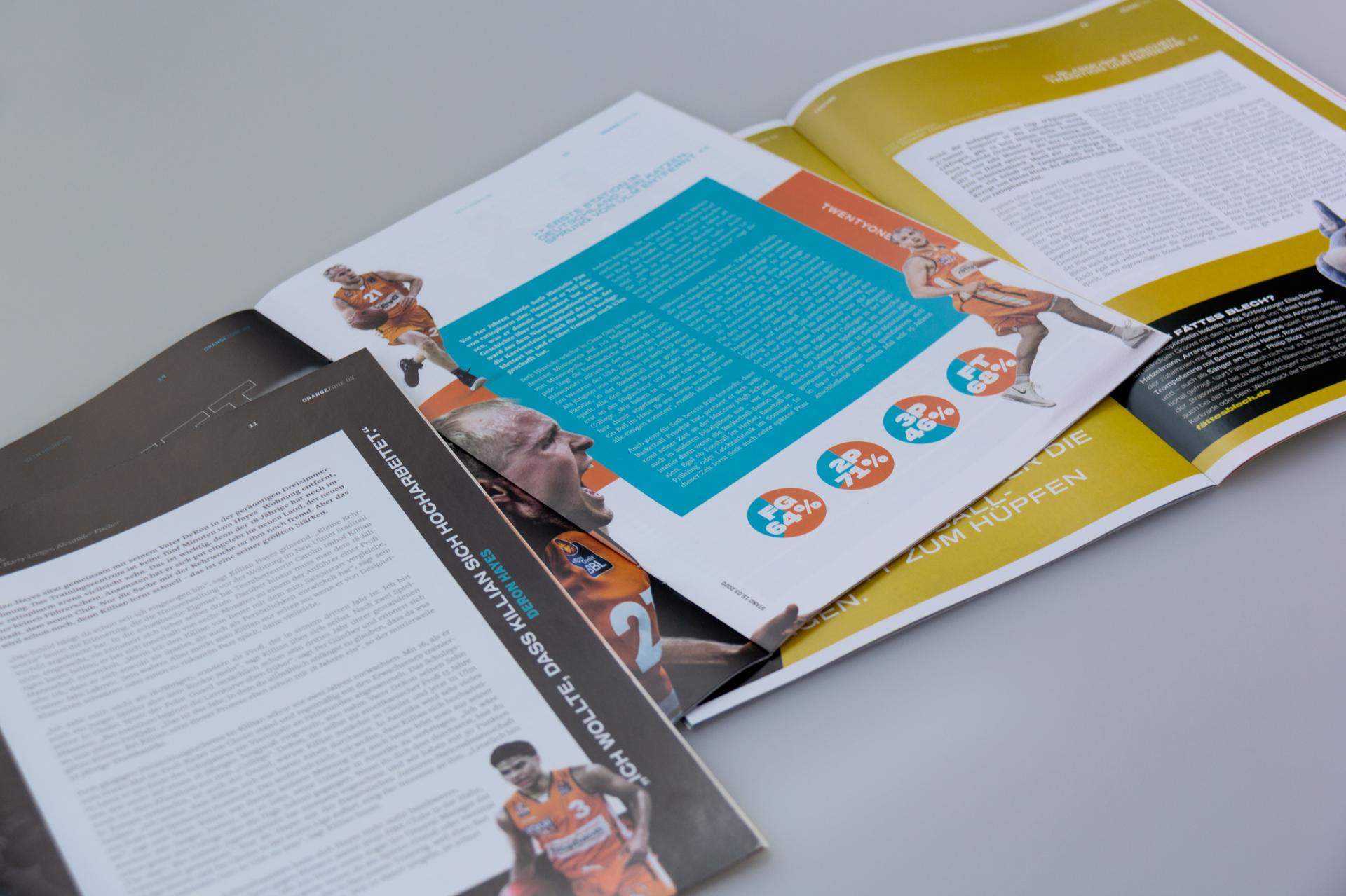
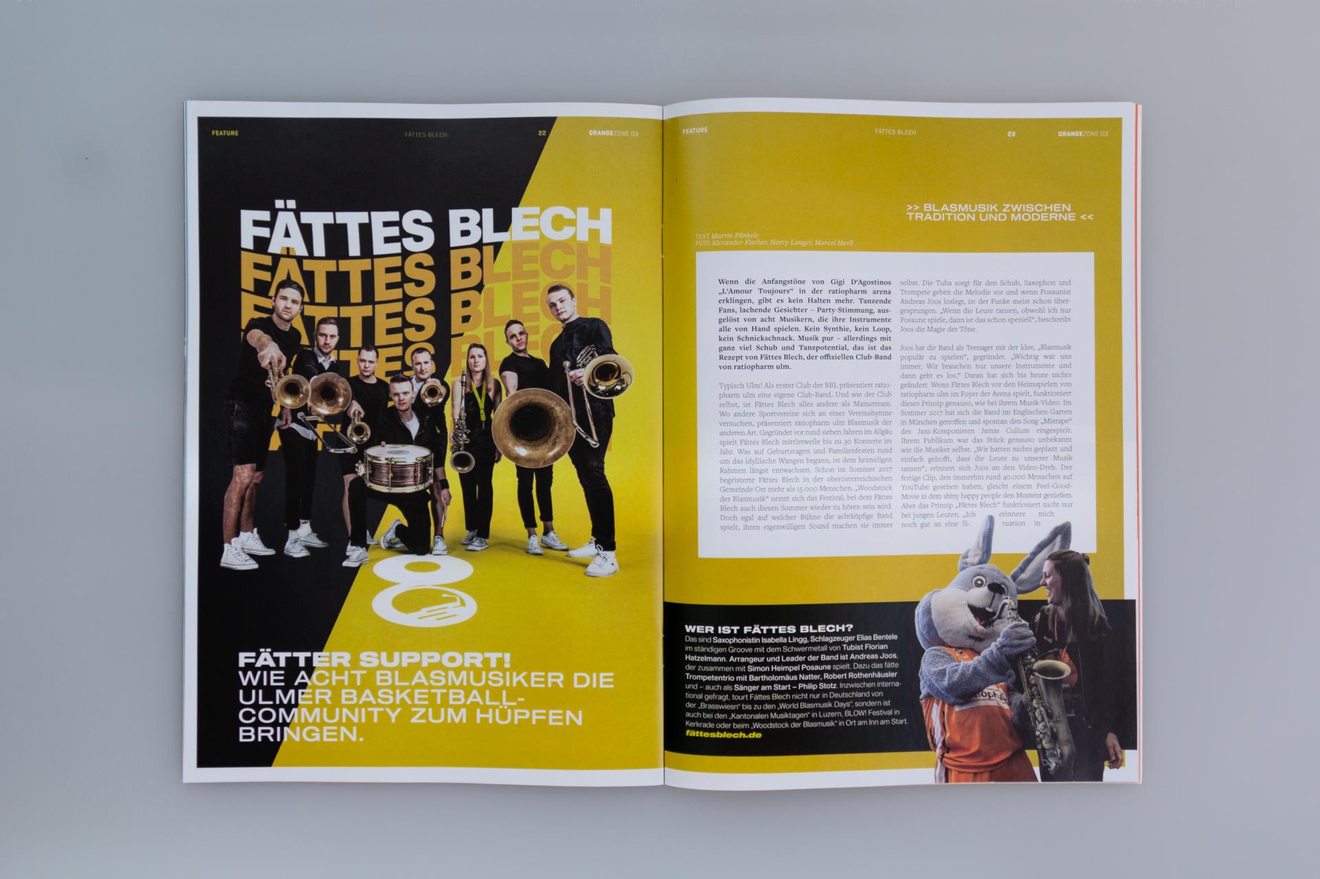
The third issue of OrangeZone.mag this season is a blast! Because compared to the last magazine, in which the reduced design at the end of the year supported a profound review of the club’s developments, we now see a significantly more active, louder look. The colors are brighter, the typography more striking, and the images more combative.
Client
Pernod Ricard Swiss
Services
Print
Motion
Social Media
Partners
Sound Circle Music
Similar Projects
Pernod Ricard – ABSOLUT Extrakt – Illuminated Posters
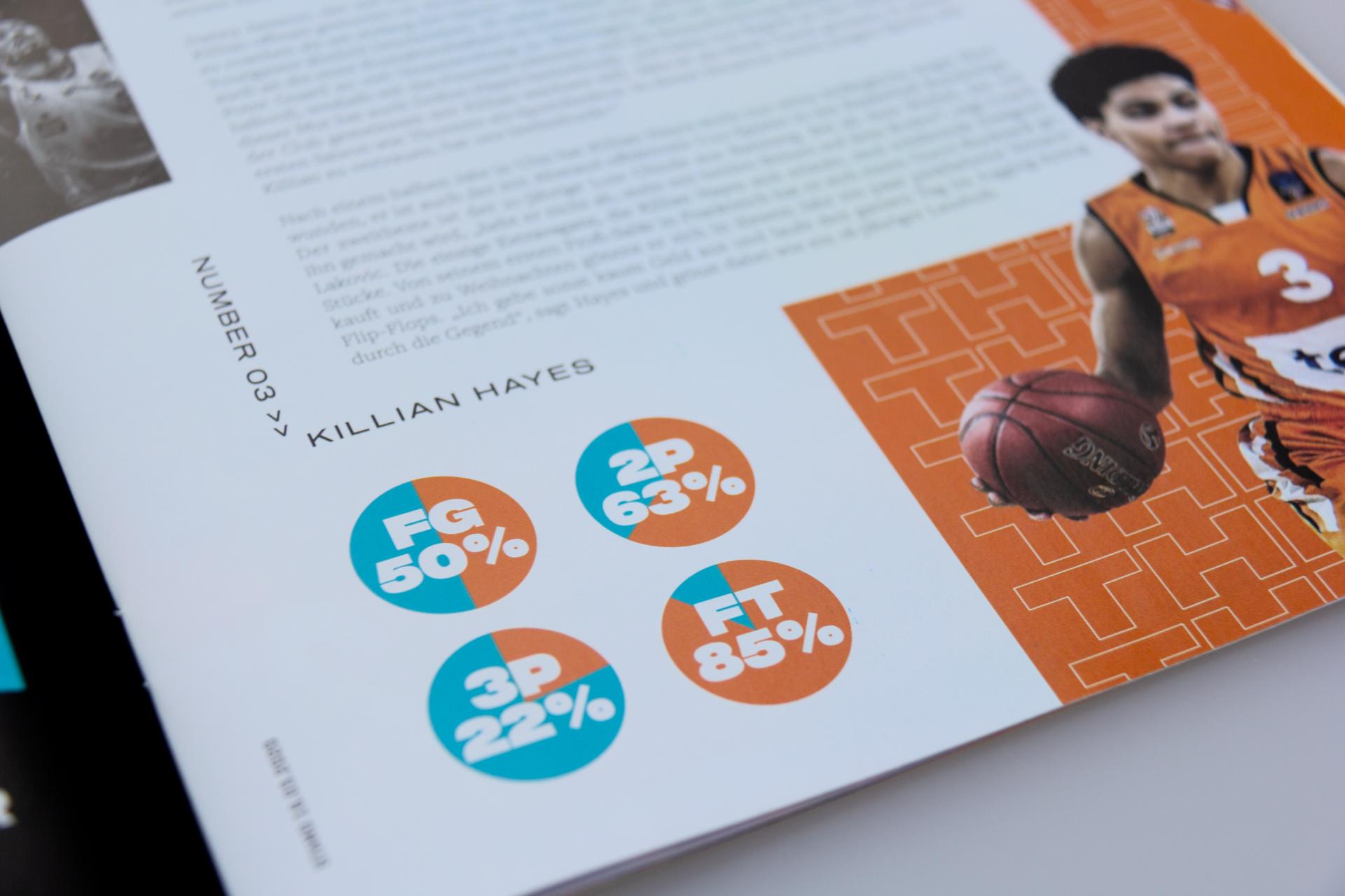
High-contrast color fields, action-packed photographs emphasized by cut-outs, and expressive typography are the most striking stylistic devices of the look & feel. And another detail immediately catches the eye as you leaf through: a centered layout with texts placed in the middle of the pages’ type area, strong, focused. After all, the content is also about a combative call for sport and for standing together against the virus. The new colors also draw attention, expanding the familiar color spectrum of orange, white, and black used by ratiopharm ulm. All items with a direct connection to ratiopharm ulm shine in a rich turquoise. Other items in the issue, by contrast, got a yellow or green coat of paint. Because when it comes to combative statements, the design can certainly pack a punch too!
Personalized consulting for every strong brand
and those that want to become one.
Hubertus von Kolkow
+49 731 140 36 – 10 | h.vkolkow@agentur-halma.de | » To the appointment calendar